Logo design & brand direction
Primary marks, alternate marks, color, type, icon systems, and the visual rules that keep everything recognizable.
Complete brand creation
ManicWebmaster builds the full visual system around a business: identity, print pieces, launch graphics, menu design, website design, and the CTA flow that turns the look into action.
What gets designed
Branding is not a logo floating alone in space. It is the menu they scan, the flyer they keep, the website they trust, the post they click, and the sign that tells them they found the right place.
Primary marks, alternate marks, color, type, icon systems, and the visual rules that keep everything recognizable.
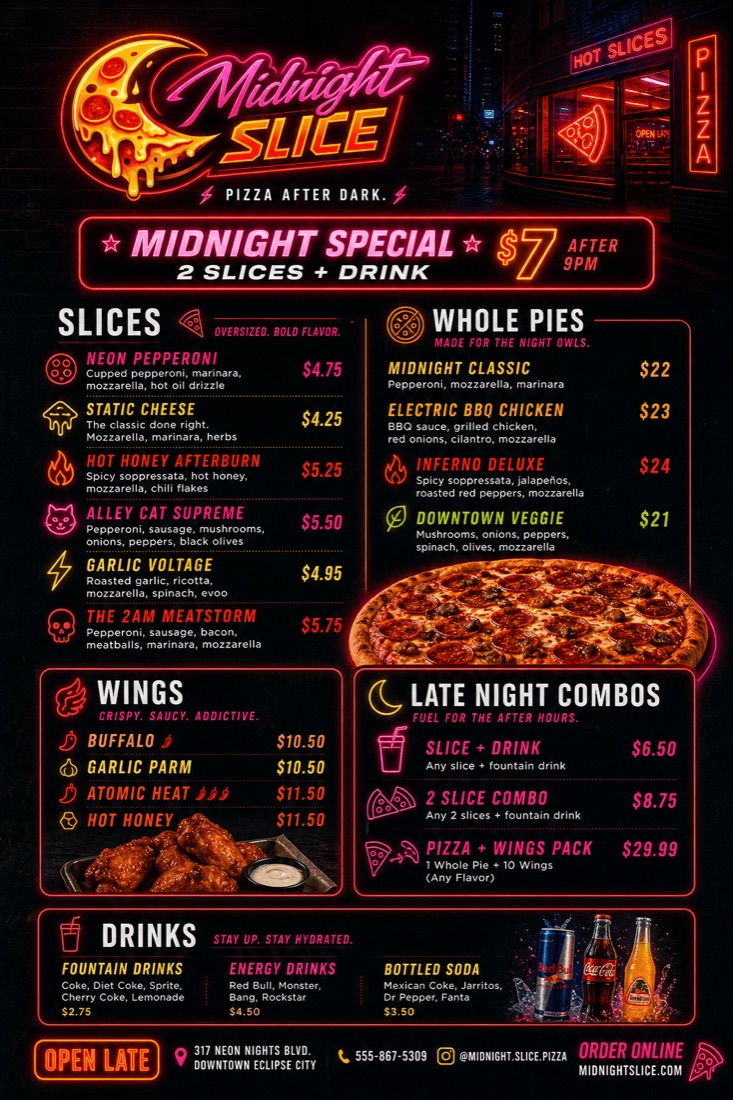
Restaurant menus, service menus, launch flyers, promo sheets, handouts, table tents, cards, and print-ready PDFs.
Home pages, landing pages, section art, banners, CTA blocks, mobile layouts, and visual systems for conversion.
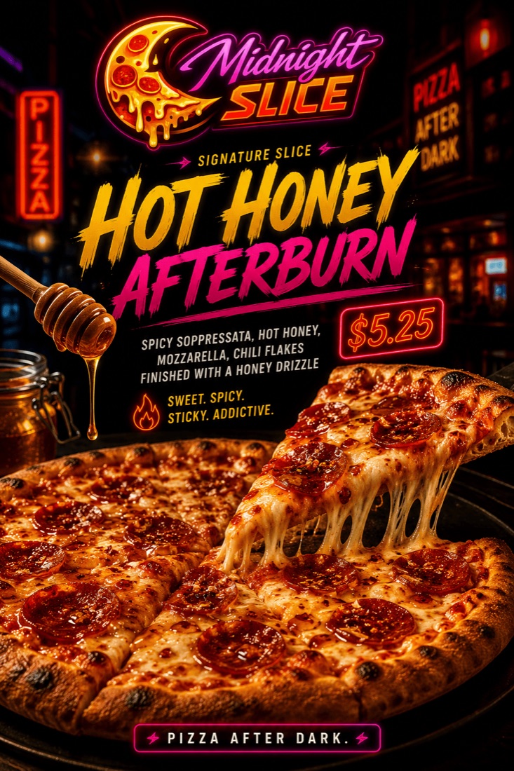
Opening graphics, specials, stories, posts, ads, thumbnails, cover images, and the pieces that make a launch feel loud.
Portfolio case study
A fictional late-night pizza concept built as a full brand world: neon logo, menu hierarchy, special-offer promo art, social-ready campaign pieces, and a web direction that feels open after midnight.

The brand kit
The goal is not just to make something attractive. It is to leave you with a practical system that can survive the next flyer, menu update, website section, sign quote, social post, and rushed deadline.
Ways to start
Some businesses need the whole world built. Some need the existing brand cleaned up before a launch. Some need the key pieces customers will see this week.
For new businesses, new concepts, re-openings, and ideas that need a full visual identity before launch.
For businesses that need a logo, menu, flyer, web page, social set, and campaign direction to feel like one voice.
For blurry logos, inconsistent Canva pieces, scattered colors, messy menus, and old assets that need a real system.
Strong start, sharp finish
Text Matt with your business, deadline, and what you need designed: logo, menu, flyer, website, social graphics, or the whole thing. The first move is simple.